Incremental Mapreduce for Analytics with R
I’ve been wanting to describe some of my work with using R to help me understand data I’m collecting in Couchbase Server† because I find it quite interesting, useful and easy. However, it’s been difficult for me to figure out a good starting point because I don’t know who the audience would be. That is, finding the right set of assumptions to get going has been quite hard.
Last week, however, I spoke to a really awesome guy in a media company who had a specific question: “How can my analyists report on all the wonderful data I’m storing in Couchbase?” I dug deeper. Who are these analysts? What tools do they use?
† the incremental Map Reduce Views are identical to Apache CouchDB views, so everything will also work with CouchDB
My Audience
Turns out, the analysists pretty close to what I would imagine. They often use some kind of data warehousing tools from Oracle that do all kinds of great magic, and then fall over really hard if you drift outside of bounds they’re comfortable with. This sounded like something I could ignore. But then he said something that gave me a pretty solid foothold. While they’re not programmers, they do use R as part of their data analysis.
Because this question was asked by a Couchbase user who wanted to know how to get his data out, I’m going to assume anyone reading this knows R a bit better than Couchbase.
About Views
There are a lot of things you can read if you want to understand the couch view concept. The view chapter of the Couchbase Server Manual covers the concept pretty well. If you want to know everything you can know, then dig through that, but for most of my uses, it really comes down to three things:
- Extract the useful information.
- Sort it, putting like things together.
- Do some basic aggregation.
That’s how I take a lot of data and turn it into useful information most of the time. Hopefully the examples that follow will help you do the same.
The Data
The hardest part of any data grokking tutorial is that it’s never about your data. This simultaneously makes it less interesting to the reader and often makes it a bit harder to apply to your own problems.
Unfortunately, the most interesting data I regularly extract for reporting is somewhat sensitive, so I can’t share the things that I’ve got the most use out of, but I’m hoping this will help lead you to something interesting.
The data I’ve chosen to work with is the SFPD Reported incidents set from the SF Data Website web site. It’s pretty much everything that the SFPD has reported since 2003.
These documents are pretty regular and flat. Your data may be more complicated, but the techniques are the same. Let’s begin by looking at an example document from the SFPD data set:
{
   "category": "Prostitution",
   "incident_id": 90096348,
   "district": "Tenderloin",
   "timestamp": "2009-01-27T04:03:00",
   "lon": -122.416261836834,
   "lat": 37.7853750846376,
   "location": "Ofarrell St / Hyde St",
   "time": "04:03",
   "date": "2009-01-27",
   "resolution": "Arrest, Cited",
   "day": "Tuesday",
   "desc": "Solicits To Visit House Of Prostitution"
}
I think I can understand what all these things are, so let’s get to work.
Getting Data into R
There are a few packages I’ll be using here, so let’s make sure we get those into your R before we go:
install.packages(c('rjson', 'ggplot2', 'reshape'),
                 dependencies=TRUE)

require(rjson)
require(reshape)
require(RColorBrewer)
require(ggplot2)
As R likes “square” data, I tend to have the output of my views be very regular, which also means I can have very simple functions for taking a view and pulling it back out. For this purpose, I have some basic common setup in my R scripts that looks like this:
# Pointer to your couchbase view base.  This is where you find your
# own data
urlBase <- 'http://couchbase.example.com/sfpd'

# This is your basic GET request -> parsed JSON.
getData <- function(subpath) {
        fromJSON(file=paste(urlBase, subpath, sep=''))$rows
}

# And this flattens it into a data frame, optionaly naming the
# columns.
getFlatData <- function(sub, n=NULL) {
        b <- plyr::ldply(getData(sub), unlist)
        if (!is.null(n)) {
                names(b) <- n
        }
        b
}

# Also, I'm going to be working with days of week, so I need these:
dow <- c('Sunday', 'Monday', 'Tuesday', 'Wednesday',
         'Thursday', 'Friday', 'Saturday')
shortdow <- c('Sun', 'Mon', 'Tue', 'Wed', 'Thu', 'Fri', 'Sat')
Overall Crime Report Count
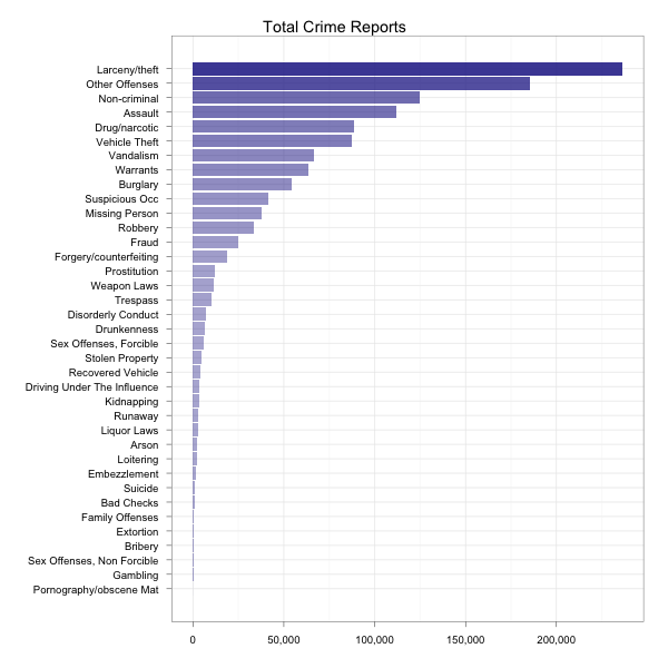
As with most data sets, I don’t actually even know where to start, so first let’s just see what kinds of crimes we’ve got. I’m interested in total counts and counts by day of week. The nice thing is that with couch views, I can build a single view that will tell me either. Let’s look at the view source:
function(doc) {
  emit([doc.category, doc.day], null);
}
Looks really simple, but combined with the _count built-in reducer,
this can do a lot of neat things when grouping. With group_level=1,
we get crime count by category. Let’s plot that and see what’s
popular. Assuming we saved that in a design document called
categories with the view name of byday, here’s what you tell R:
# Get a dataframe containing the categories and their respective counts
cat <- getFlatData('_design/categories/_view/byday?group_level=1',
                   c('cat', 'count'))

# The columns come back as strings and requires fixes to make it useful
cat$cat <- factor(cat$cat)
cat$count <- as.numeric(cat$count)
# Also, I found sorting it by count made it easier to understand
cat$cat <- reorder(cat$cat, cat$count)

# Now plot it.
ggplot(cat, aes(cat, count, alpha=count)) +
       geom_bar(fill='#333399', stat='identity') +
       scale_alpha(to=c(0.4, 0.9), legend=FALSE) +
       scale_y_continuous(formatter="comma") +
       labs(x='', y='') +
       opts(title='Total Crime Reports') +
       coord_flip() +
       theme_bw()
Then R will give you this:
By Day of Week
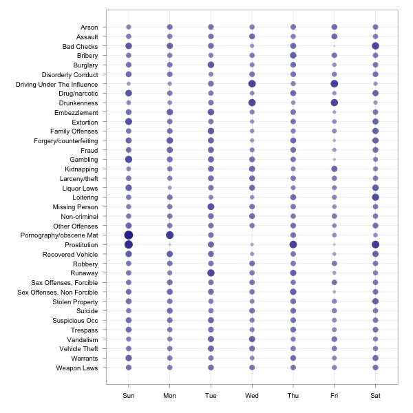
I found this to be somewhat interesting, so I wanted to know what the
distribution was by day of week. I can use the same view above with
group_level=2, but since the rates are tremendously different, I had
R compute the relative variance across the data frame for each
category by day of week and then plotted that. Here’s the R code:
# Grab the same data, but separated by day of week.
cat_byday <- getFlatData('_design/categories/_view/byday?group_level=2',
                         c('cat', 'day', 'count'))

# I'm doing similar fixup to the above, but with another ordering and
# a couple views of day of week (much for playing around)
cat_byday$cat <- factor(cat_byday$cat)
cat_byday$cat <- reorder(cat_byday$cat, cat_byday$cat)
cat_byday$count <- as.numeric(cat_byday$count)
cat_byday$cat_by_count <- reorder(cat_byday$cat, cat_byday$count)
cat_byday$day <- factor(cat_byday$day, levels=dow)
cat_byday$shortdow <- factor(cat_byday$day, levels=dow, labels=shortdow)

# Compute the percentage of each category by its day of week
a1 <- aggregate(cat_byday$count, by=list(cat_byday$cat), sum)
a2 <- aggregate(cat_byday$count, by=list(cat_byday$day,cat_byday$cat),
                sum)
total_per_day <- rep(a1$x, rep(7,length(a1$x)))
cat_byday$perc <- a2$x / total_per_day

# Let's see what this looks like
ggplot(cat_byday, aes(shortdow, cat, size=perc, alpha=perc)) +
    geom_point(color='#333399') +
    scale_alpha(legend=FALSE) +
    scale_size(legend=FALSE) +
    scale_y_discrete(limits=rev(levels(cat_byday$cat))) +
    labs(x='', y='') +
    theme_bw()
That seems like a lot of setup, but it was mostly just type setup and stuff. We’ll reuse some below. At this point, we’ve got something to look at, though:
Focused Subset
There’s a lot of data here and it’s all relative making it hard to kind of see how to compare things. I wanted to really look at a couple of areas and figure out what kinds of correlations existed. As I already had the data loaded, I figured I’d just grab a subset of what was already requested and facet plot it.
# Pick a few categories of interest
interesting <- c('Drug/narcotic',
                 'Prostitution',
                 'Drunkenness',
                 'Disorderly Conduct')

# Extract just this subset and refactor the categories
sex_and_drugs <- cat_byday[cat_byday$cat %in% interesting,]
sex_and_drugs$cat <- factor(as.character(sex_and_drugs$cat))

ggplot(sex_and_drugs, aes(shortdow, count)) +
       facet_wrap(~cat, scales='free_y') +
       geom_bar(fill='#333399', stat='identity') +
       scale_y_continuous(formatter="comma") +
       labs(x='', y='') +
       opts(title='Select Crime Reports by Day') +
       theme_bw()
And that should show me a lot more detail on these individual categories.
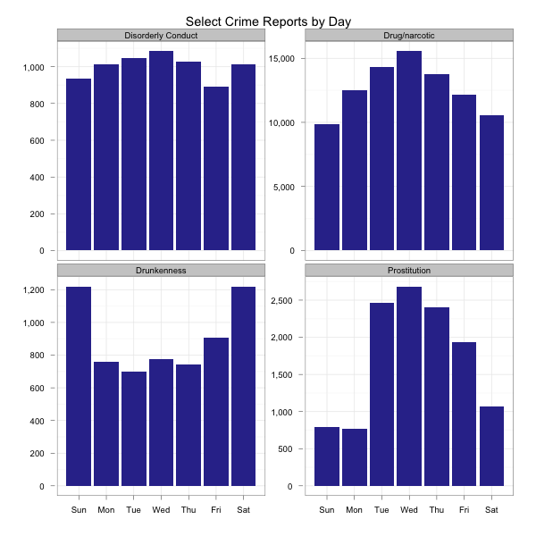
Personally, I found the lack of correlation between alcohol related incidents and others quite interesting. Alcohol seems to be the anti-drug. Maybe prostitutes don’t like drunks. Who knows…
Over Time
At this point, I realized the data’s going back to 2003 and I haven’t even considered whether things are getting better or worse. I didn’t really explore this very much, but wanted to get a quick feel for whether things are getting better or worse. Here’s a view that will tell us incident rates by year and category:
function(doc) {
  var ymd = doc.date.split('-');
  emit([parseInt(ymd[0], 10), doc.category], null);
}
As in all these examples, I combine this with the _count built-in
reduce. Let’s just chart up the yearly rates with the following R:
byyear <- getFlatData('_design/categories/_view/by_year?group_level=1',
                      c('year', 'count'))
byyear$year <- as.numeric(byyear$year)

# There's not enough 2012 here, so let's ignore that for this chart.
ggplot(byyear[byyear$year < 2012,], aes(year, count)) +
    stat_smooth(fill='#333399') +
    labs(y='', x='') +
    scale_y_continuous(formatter=comma) +
    opts(title="Total Incident Reports by Year") +
    theme_bw()
What’s this tell us?
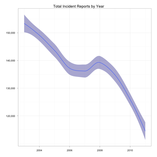
Looks like things are getting better (or police are getting lazier). I could dig into this a bit more to find out whether it’s true for all categories, but I’m not that interested, so let’s look at something else.
Crime by Area
I was interested in knowing whether certain crimes were more popular
in some areas than others. I’m using the doc’s district property
for this (rather than the built-in coordinates) and thought it might
be a good use case for a heatmap.
One thing I noticed is that some reports don’t have a district associated with them. I chose to ignore those for this report, but you can quite easily see how you might substitute it with a custom value if you wanted to specifically consider it. Let’s begin with the following view code:
function(doc) {
  if (doc.district != null) {
    emit([doc.category, doc.district], null);
  }
}
Of course, we’ll use the _count built-in again. One thing I should
note about this is that while I did originally plot all data, I
later decided that I wasn’t interested in any area that had less than
1,000 crimes reported. As this is the output of the filter, I
needed to apply that in R as we have no means of requesting that from
couch a view (since the views are materialized and the map function
did not include a filter before the reduce was applied). Ideally,
we’d support this in the actual view request, but in the meantime, we
can extract it easily in post:
by_region <- getFlatData('_design/region/_view/by_cat_region?group_level=2',
                          c('cat', 'region', 'count'))
by_region$count <- as.numeric(by_region$count)
by_region$region <- factor(by_region$region)

# Ignore anything that doesn't have at least 1,000 incidents
pop_regions <- by_region[by_region$count > 1000,]
pop_regions$cat <- factor(as.character(pop_regions$cat))
# And have the hottest crimes float to the top
pop_regions$cat <- reorder(pop_regions$cat, pop_regions$count)

ggplot(pop_regions, aes(x=region, y=cat, fill=count, alpha=count)) +
    geom_tile() +
    scale_fill_continuous('Incidents',
                          formatter=function(x)
                                      sprintf("%dk", x / 1000)) +
    scale_alpha_continuous(legend=FALSE, to=c(0.7, 1.0)) +
    labs(x='', y='') +
    theme_bw() +
    opts(title='Crime Types by District',
         axis.text.x=theme_text(angle=-90),
         legend.position='right')
That gives us the following heatmap:
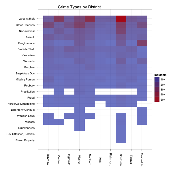
The blank areas didn’t have 1,000 incidents of the specified type of crime in the indicated area since 2003. The lighter blue areas have had some incidents. The bright red have the most. Looks like I want to avoid the southern district.
How Many Does the DA Refuse?
As an example of pulling a server-side aggregate on part of the data, I found the “District Attorney Refuses To Prosecute” resolution type particularly interesting, so I wanted to know how often this happens. Again, we start with a simple view:
function(doc) {
  emit([doc.resolution, doc.category], null);
}
Then we do our normal _count thing. However, the difference here is
that when I do the request, I want to use the start_key and
end_key parameters to find only things that were resolved in this
way. I happen to know that the list of resolutions goes from
“District Attorney Refuses To Prosecute” to “Exceptional Clearance”,
so I can just look for things that start with “Di” and end with things
that start with “Dj”. These are also arrays I’m emitting, so it’s
really based on the first element of the array. The R code then looks
like this:
by_resolution <- getFlatData(paste('_design/resolution/_view/by_res_cat',
                                   '?group_level=2&start_key=["Di]',
                                   '&end_key=["Dj"]', sep=""),
                             c('resolution', 'cat', 'count'))
by_resolution$count <- as.numeric(by_resolution$count)
by_resolution$cat <- factor(by_resolution$cat)
by_resolution$cat <- reorder(by_resolution$cat, by_resolution$count)

ggplot(by_resolution, aes(cat, count, alpha=count)) +
    scale_alpha(to=c(0.4, 0.9), legend=FALSE) +
    coord_flip() +
    geom_bar(fill='#333399', stat='identity') +
    labs(x='', y='') +
    opts(title='Crimes the DA Refused to Prosecute') +
    theme_bw()
R then gives us the following:
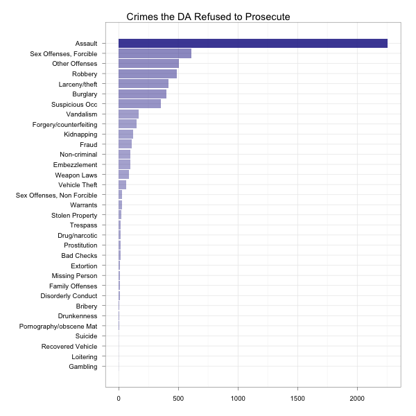
Do note that these are absolute numbers. Don’t call up SF and complain because they don’t care about assault as they care about vandalism. There are simply more of those cases. I’ll leave as an exercise to the reader evaluating resolution types by category and deciding what to think about them.
In Conclusion
I could obviously keep going with this for days, but just wanted to help people understand my process. In most places I use this, the patterns are similar. Data sets may grow very large, but the aggregations remain small. Incremental processing of the views means my sorted and aggregated answers continue to arrive quickly and processing remains cheap.
